# Static Ad Examples: 16 Image Ads Brands Kept Running (2026)
> 16 real static Facebook and Instagram ads, from an 814-day before/after to Notes-app reviews and memes, grouped by format, with what to steal from each.
- **Author**: Marxx
- **Published**: 2026-09-19
- **Category**: Creative strategy
- **URL**: https://marxx.ai/posts/static-ad-examples
---
Static ads are supposed to be dead. Video gets the attention, and every guide tells you to make Reels.
Then you look at what brands actually keep paying for. The longest-running ad we found for this post is a single image of a fridge that ran for **814 days**. Several others in this list ran for 200 to 400 days.
Every example here comes from the Marxx ad library, and every one was picked because the brand kept paying to run it. We don't have anyone's CTR or ROAS, and we won't invent them. How long an ad ran, and how many copies ran together, is the proof we can show.
The 16 statics are grouped by **format**, so you can steal a layout, not just an idea.
## TL;DR
- Statics are still some of the longest-running ads on Meta. Factor's before/after ran 814 days and Gymshark's meme 396.
- The statics that last do one job in one glance: prove it, look native, sell the offer, or build the brand.
- Lo-fi formats (Notes app, sticky notes, memes) keep beating polished ones for brands that sell trust.
- An offer static works best when the offer fits how people really buy: Buy 3 Get 1 for a group of four, "cheaper than takeout" for a meal kit.
- Brands scale statics by running the same image many times: Dave & Buster's put one grid on about 9 ad IDs.
## The 16 static ads at a glance
| # | Brand | Market | Static format | Proof it was backed |
|---|---|---|---|---|
| 1 | Factor | Global | Before/after split | Ran 814 days |
| 2 | Sephora | Global | Big number (63%) | Ran 61 days |
| 3 | Plum | India | Review card | Still live after 67 days, 4 copies |
| 4 | Foxtale | India | Us-vs-them table | Ran 198 days |
| 5 | The Souled Store | India | Notes app review | Ran 236 days |
| 6 | The Whole Truth | India | Handwritten sticky notes | Ran 229 days |
| 7 | Gymshark | Global | Meme | Ran 396 days |
| 8 | HelloFresh | Global | Feature callouts + price anchor | Still live after 125 days |
| 9 | Snow Kingdom | India | Offer graphic | Ran 46 days |
| 10 | Bombay Shaving Company | India | Countdown | Ran 31 days, relaunched |
| 11 | Snitch | India | Call-out question | Ran 36 days |
| 12 | Nike | Global | Text-only billboard | Ran 222 days |
| 13 | Mokobara | India | Minimal product hero | Ran 145 days |
| 14 | Taj Hotels | India | Editorial photo | Ran 109 days |
| 15 | Starbucks | Global | Illustration | Ran 52 days |
| 16 | Dave & Buster's | US | Grid | Ran 30 days, on about 9 ad IDs |
"Still live" means running on 19 September 2026, when this list was pulled.
---
## Statics that prove it
When the buyer's question is "does it work?", the image has to answer it in one look.
### 1. Factor: the empty fridge and the full one
**Global - Before/after split - Ran 814 days - CTA: Get offer**
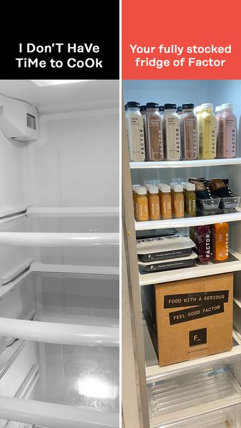
A split screen: an empty fridge on one side, a fridge full of Factor meals on the other. The headline: *"SAVE 50% OFF YOUR FIRST BOX!!"*
**Why it stops the thumb:** The whole idea reads in under a second with no words. The "before" is the viewer's own fridge on a weeknight.
**Steal this:** If your product changes something you can see, show both states side by side. This ran for over two years, the longest in this list and in all our research for these posts.
### 2. Sephora: one number
**Global - Big number - Ran 61 days - CTA: Shop now**
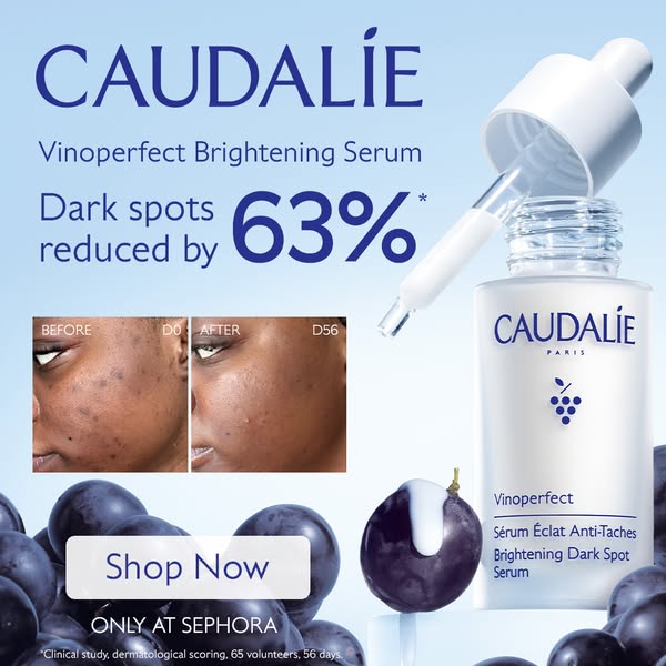
"Dark spots reduced by 63%" with a before/after skin comparison and the Caudalie serum.
**Why it stops the thumb:** A number makes a vague benefit ("brighter skin") feel measurable. The before/after shows what 63% looks like.
**Steal this:** Sephora ran the same stat under a second ad with a different headline for the same 61 days, which suggests the number was doing the work, not the layout.
### 3. Plum: real reviews on the card
**India - Review card - Instagram only - Still live after 67 days - 4 near-identical copies - CTA: Shop now**
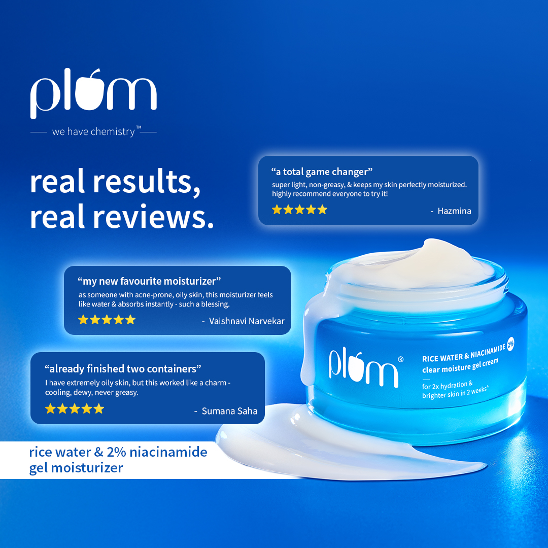
The product on a blue backdrop, with 5-star customer reviews and the line "real results, real reviews". The headline: *"More hydration, less oil."*
**Why it stops the thumb:** People with oily skin are scared of moisturiser. Reviews from people like them calm that fear faster than a brand claim.
**Steal this:** Pick reviews that answer the main objection, not the nicest ones. Four copies still live is the strongest scale signal in the Indian statics.
### 4. Foxtale: the comparison table
**India - Us-vs-them table - Ran 198 days - CTA: Shop now**
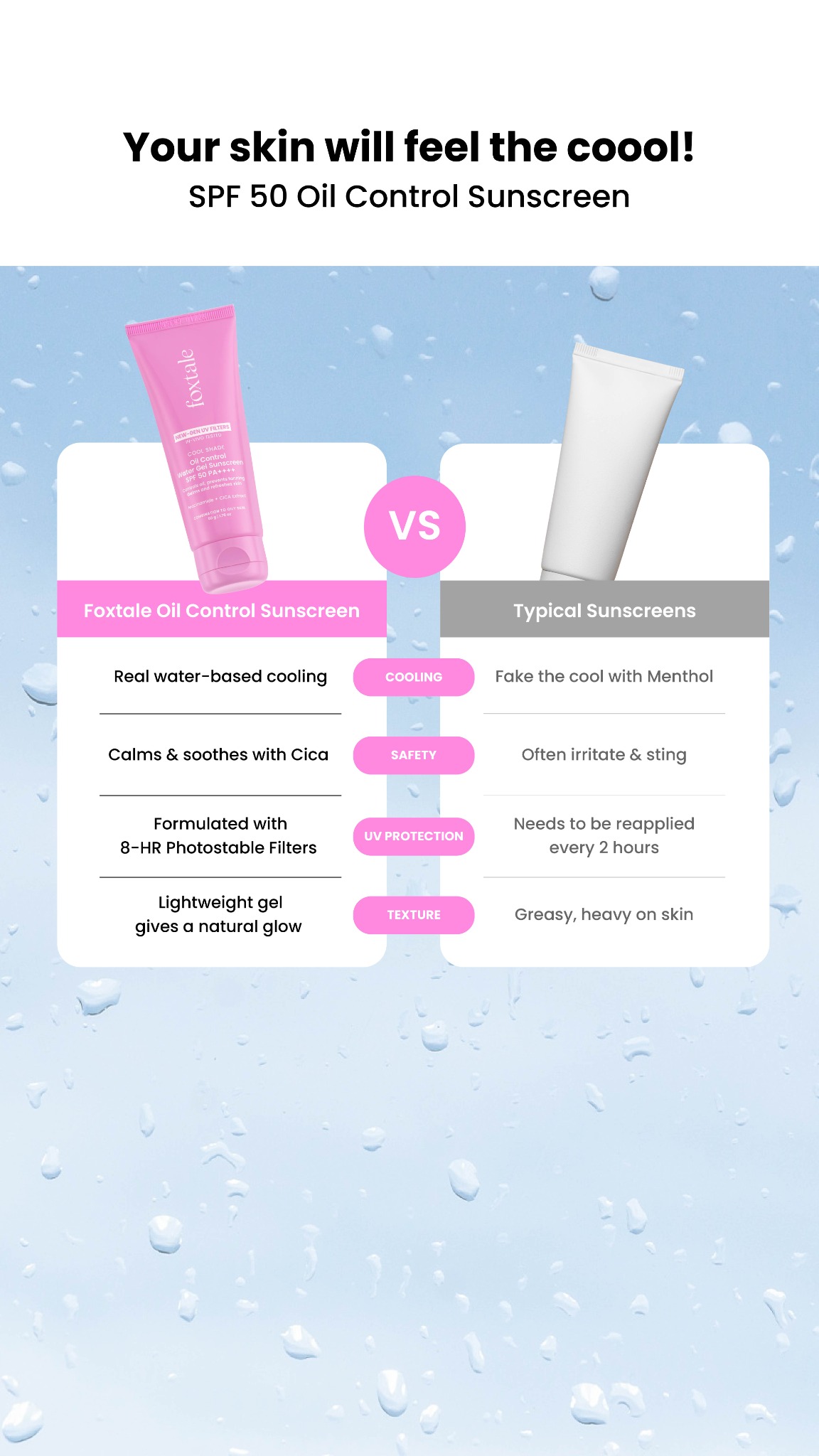
A table comparing Foxtale's cooling sunscreen with "regular" sunscreens, row by row. The copy names the problem: *"Tired of greasy, heavy sunscreens that melt off by noon?"*
**Why it stops the thumb:** Ticks and crosses are quick to scan. Each row answers a known complaint: grease, sting, reapplying.
**Steal this:** Build the table from your category's top complaints, and make every row one objection handled. It ran through the whole Indian summer.
---
## Statics that look native
These ads borrow the look of something people already stop for: a phone screen, a handwritten note, a meme.
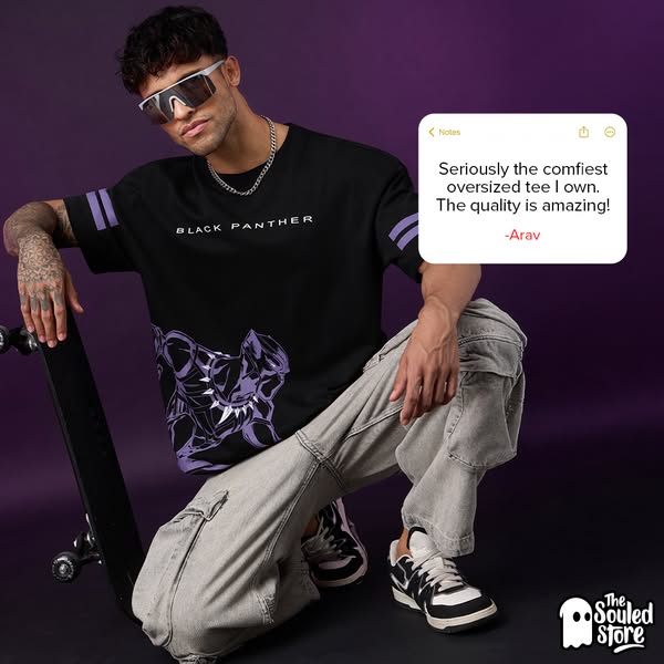
### 5. The Souled Store: a review in the Notes app
**India - Notes app mockup - Ran 236 days - CTA: Shop now**
A customer review typed into a phone's Notes app, beside a model wearing the oversized tee. The headline: *"Oversized Fit. Maximum Style."*
**Why it stops the thumb:** It looks like a screenshot a friend sent you, not a polished testimonial.
**Steal this:** The format works for more than reviews. Bombay Shaving Company ran a Notes app static ("THIS IS SUPER CONFIDENTIAL!!") for 401 days to announce a sale.
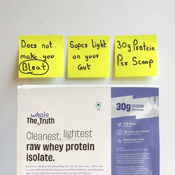
### 6. The Whole Truth: sticky notes
**India - Handwritten sticky notes - Ran 229 days - CTA: Order now**
Yellow sticky notes on a white wall above the tub, with the top one reading "Does not make you bloat." The copy: *"Does your whey protein cause bloating?"* The offer is a 20% code.
**Why it stops the thumb:** Handwriting reads like a person, not marketing. In a category full of shiny tubs, a plain wall stands out.
**Steal this:** Put the category's biggest complaint on the top note, and let the product sit underneath as the answer. It fits a brand whose whole promise is honesty.
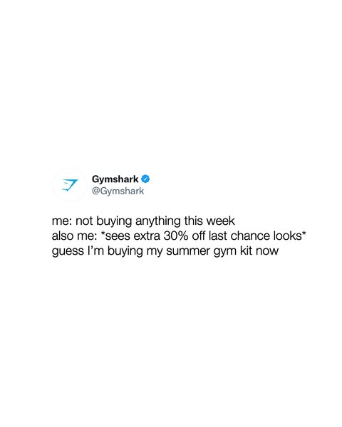
### 7. Gymshark: "me vs. also me"
**Global - Meme - Instagram only - Ran 396 days - CTA: Shop now**
A plain text meme on a white background in the "me vs. also me" format, about the voice in your head that wants to buy. The headline: *"Extra 30% Off."*
**Why it stops the thumb:** It's a joke about the viewer's own impulse, so a sale ad reads like something to share.
**Steal this:** A meme turns a discount into a moment people recognise. It's cheap to make and ran over a year without the joke wearing out.
---
## Statics that sell the offer
An offer static has one job: make the deal clear and make it feel right for how people actually buy.
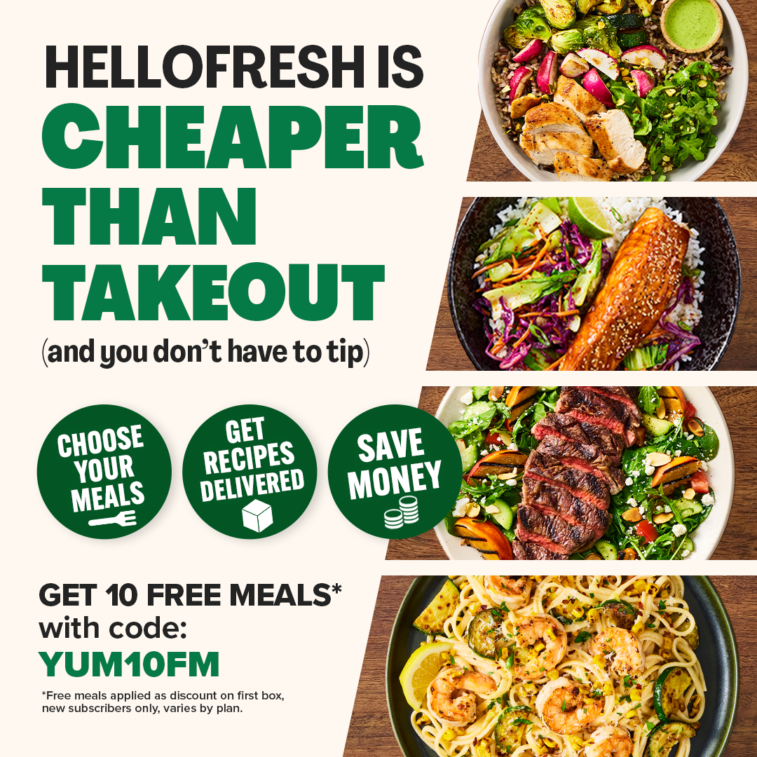
### 8. HelloFresh: cheaper than takeout
**Global - Feature callouts + price anchor - Still live after 125 days - CTA: Order now**
"HelloFresh is cheaper than takeout (and you don't have to tip)", with round icons for the features and a banner for 10 free meals.
**Why it stops the thumb:** It compares the price with the right thing. Next to groceries a meal kit looks expensive; next to takeout it looks cheap. "You don't have to tip" is a small, very human detail.
**Steal this:** Choose what your price is compared with. Then use icons to back up the offer with reasons (time, choice, delivery).
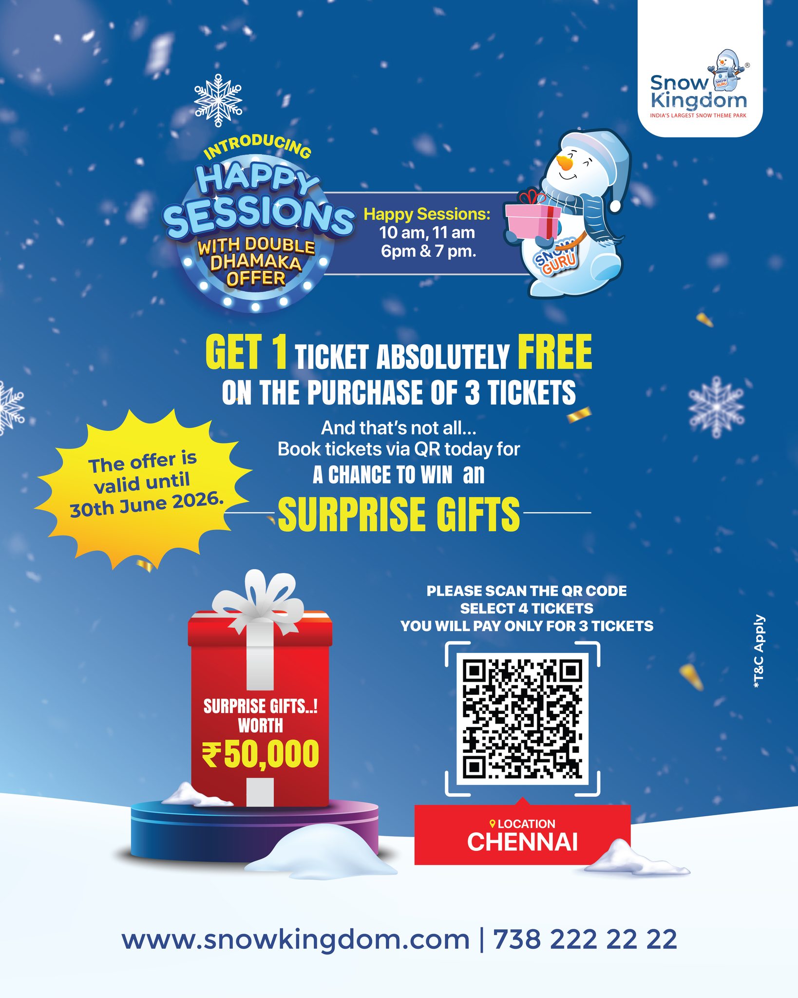
### 9. Snow Kingdom: Buy 3 Get 1
**India - Offer graphic - Ran 46 days - CTA: Get offer**
"GET 1 TICKET ABSOLUTELY FREE ON THE PURCHASE OF 3 TICKETS", with a mascot and a QR code on a winter background.
**Why it stops the thumb:** Families and friends visit in groups of four, so the offer matches the real booking.
**Steal this:** Tie the offer to quiet hours. This one was only valid for "Happy Sessions" (10 and 11 AM, 6 and 7 PM), so it filled slow slots instead of discounting busy ones. For more venue ideas, see [Marxx for experience venues](/for/experience-venues).
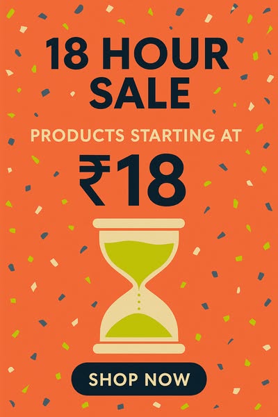
### 10. Bombay Shaving Company: 18 hours
**India - Countdown - Ran 31 days - CTA: Shop now**
"18 HOUR SALE" in bold type with an hourglass on an orange background. The headline: *"Prices Start @ INR 36."*
**Why it stops the thumb:** A named, short window gives a reason to buy today, not "someday".
**Steal this:** Make the deadline part of the name ("18 Hour Sale") so it's easy to remember. Bombay Shaving Company brought the same countdown back in September 2026, a sign it keeps working.
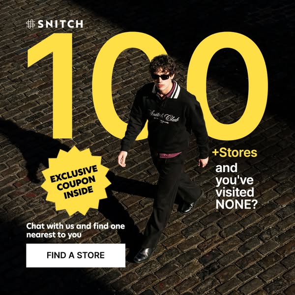
### 11. Snitch: "you've visited NONE?"
**India - Call-out question - Ran 36 days - CTA: Send WhatsApp message**
A huge "100" and "100+ Stores and you've visited NONE?" over a street scene. The copy says there's a coupon hidden in every store, and the button opens WhatsApp to find the nearest one.
**Why it stops the thumb:** It calls the viewer out, which makes a store count feel like a personal miss.
**Steal this:** Statics can drive footfall, not just online sales. A WhatsApp button plus an in-store coupon turns a scroll into a visit.
---
## Statics that build the brand
When the brand is strong or the product is the hero, less is more.
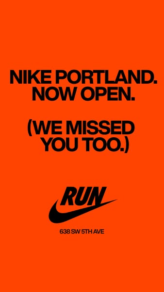
### 12. Nike: four words
**Global - Text-only billboard - Ran 222 days - CTA: Learn more**
"NIKE PORTLAND. NOW OPEN." on solid orange. The copy: *"The Nike Portland Store is now open. Get directions."*
**Why it stops the thumb:** Four huge words on one colour are impossible to miss.
**Steal this:** This only works because the name does the persuading. If your brand isn't famous, add a reason. If it is, get out of the way.
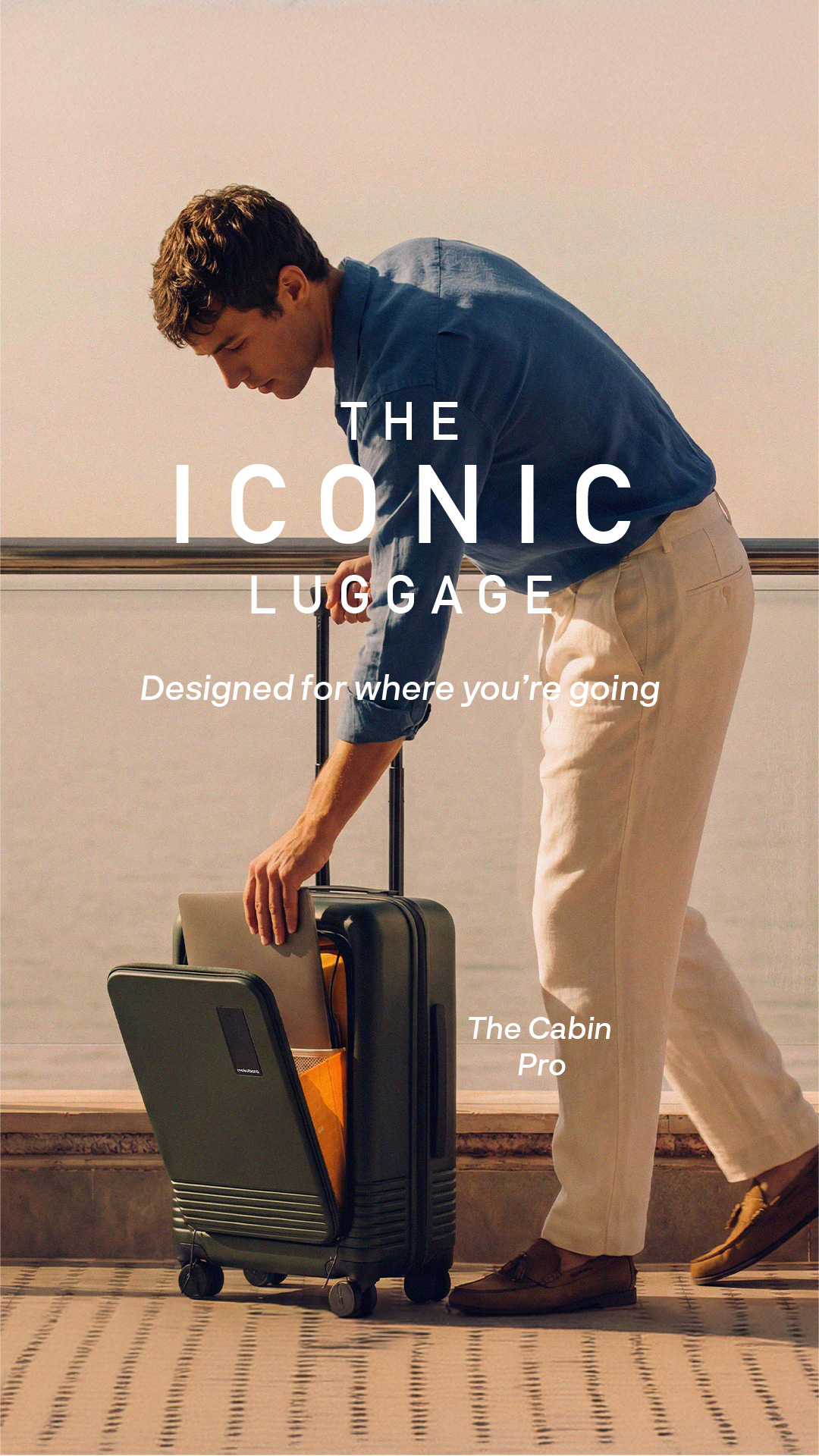
### 13. Mokobara: one feature, one product
**India - Minimal product hero - Ran 145 days, on 2 ad IDs - CTA: Shop now**
The Cabin Pro suitcase on a coastal balcony, lit like a studio shot, showing its front-access laptop pocket.
**Why it stops the thumb:** A clean product in a travel setting sells the trip, not the bag.
**Steal this:** Show one feature clearly. A premium brand protects its price by not shouting a discount.
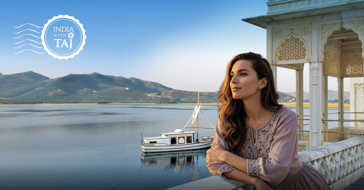
### 14. Taj Hotels: the place is the product
**India - Editorial photo - Ran 109 days - CTA: Book now**
A heritage balcony over a calm lake, with the "India with Taj" mark. The headline: *"Experience India with Taj."*
**Why it stops the thumb:** A calm, beautiful frame stands out in a feed full of offers and text.
**Steal this:** For luxury, one photo does more than a list of amenities. Taj ran a set of these, one property each, over the same months.
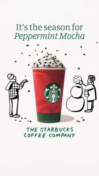
### 15. Starbucks: a hand-drawn season
**Global - Illustration - Ran 52 days - CTA: Order now**
A Peppermint Mocha cup surrounded by hand-drawn holiday art. The headline: *"Peppermint Mocha."*
**Why it stops the thumb:** Illustration marks the drink as part of a season, not just a menu item.
**Steal this:** Use one illustration style across the whole seasonal range, so every drink looks like part of one campaign. It ran for the full holiday window, which is the right lifespan for a seasonal static.
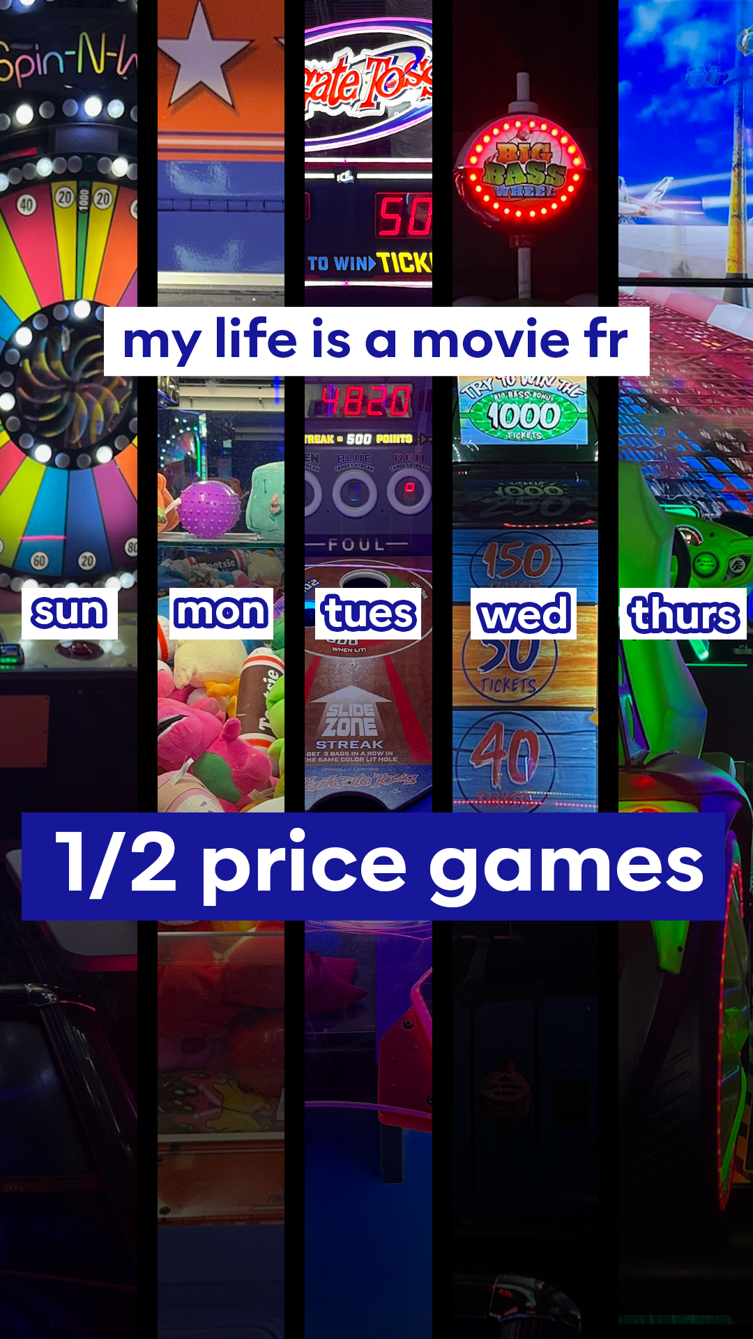
### 16. Dave & Buster's: a grid of games
**US - Grid - Ran 30 days, the same image on about 9 ad IDs - CTA: Learn more**
A vertical grid of arcade games with a Gen-Z caption, "my life is a movie fr". The copy: *"My Sundays-Thursdays are 100% booked with 1/2 price games."*
**Why it stops the thumb:** A grid shows variety in one frame, which answers "is it worth the trip?" before anyone reads.
**Steal this:** Dave & Buster's put the same image on about 9 ad IDs from May to August. When a static works, scale it across ad sets before you design a new one.
---
## Which static format should you use?
| Your goal | Format to try | Examples here |
|---|---|---|
| Prove it works | Before/after, big number, review card, comparison table | Factor, Sephora, Plum, Foxtale |
| Earn trust cheaply | Notes app, sticky notes, meme | The Souled Store, The Whole Truth, Gymshark |
| Sell an offer | Price anchor, group deal, countdown, call-out | HelloFresh, Snow Kingdom, BSC, Snitch |
| Build the brand | Text-only, product hero, editorial, illustration, grid | Nike, Mokobara, Taj, Starbucks, D&B |
## Common static ad mistakes
- **Too many messages in one image.** The statics that last say one thing.
- **Text that only works if you read all of it.** People glance. The picture has to carry the idea.
- **Polished when trust is the problem.** For skincare, protein and apparel, the lo-fi formats here outlasted the glossy ones.
- **An offer that doesn't fit how people buy.** Match the deal to the real basket: a group of four, a first box, a quiet time slot.
- **Retiring a winner too soon.** Several of these ran for 200 to 800 days. Scale what works before you replace it.
## A checklist before you launch a static
1. Can someone get the idea in one second, without reading the copy?
2. What's the format's job: prove, look native, sell the offer, or build the brand?
3. Does the headline in the copy say the same thing as the image?
4. If there's an offer, what's its job: the hook, the reward, or the push over the line?
5. Is it sized for placements (1:1 or 4:5 for feed, 9:16 for Stories)?
6. What's the next test: a different format, not a different font?
## How to find the statics your competitors keep running
Every ad in this post came from Marxx. We pulled each brand's image ads, sorted them by how long they'd been live, and checked the format Marxx tagged on each one: before/after, Notes app, meme, comparison table and more.
- [Competitor tracking](/features/competitor-tracking): follow any brand's live ads and sort by longest running.
- [Creative intelligence](/features/creative-intelligence): see the format, hook and offer behind each ad.
- [AI Ad Analyzer](/ai-ad-analyzer): check your own static before you spend on it.
Designing statics for clients? See [Marxx for creative teams](/for/creative), or [book a demo](/book-a-demo).
## FAQs
### What is a static ad?
A static ad is a single image ad, with no video or motion. On Facebook and Instagram it shows in the feed, Stories and Reels, usually with a headline, a short piece of copy and a button.
### Do static ads still work in 2026?
Yes. In this list, Factor's before/after static ran 814 days and Gymshark's meme ran 396. Statics are quick to make and quick to read, which makes them easy to test and easy to scale.
### What's the best size for a static ad?
Use 1080 x 1350 (4:5) or 1080 x 1080 (1:1) for the feed, and 1080 x 1920 (9:16) for Stories and Reels. Keep the key message away from the edges so it isn't hidden by buttons.
### Static ads or video ads: which is better?
Neither by default. Use a static when one image can say it (a result, an offer, a number, a review). Use video when the proof is movement or a person talking. See our [Facebook ad examples](/blog/best-facebook-ads-examples) for both side by side.
### How many static ads should I test at once?
Test formats, not small changes. Three to five different formats (say, a review card, a before/after and a meme) will teach you more than ten versions of one layout.
### How do I see which static ads my competitors run?
Use an ad intelligence tool that shows each ad's format and how long it has been live. In [Marxx](/features/competitor-tracking), you can filter any brand to image ads and sort by longest running.
---
- [More Creative strategy articles](https://marxx.ai/posts/category/creative-strategy)
- [All articles](https://marxx.ai/posts)